Showing posts with label Alexander Horne design. Show all posts

Tuesday, November 27, 2012

DESIGN: POW WOW LOGO DESIGN


"Pow Wow Labs is a knowledge-mixer atelier that triggers innovation and leadership mindsets inside companies through bespoke workshops and inspiring keynotes." My logo design for the 'Pow Wow Labs' hints at the fun and interactive methodologies used by Delia and Alexandra (Pow Wow founders), as well as the scientific lab aspects of learning. View the Pow Wow Labs website for more details and information on booking.
'POW WOW LABS' logo design by Alexander Horne, 2012

Sunday, March 25, 2012

DESIGN: Mr. Wolf Magazine

Mr. Wolf Magazine is a new magazine concept from Swedish based Australian writer/editor Laura Philips. Earlier this year I was asked by Laura to design some proposals for potentially the first printed edition of the magazine. The magazine is an Independent Quarterly profiling the leading personalities in contemporary Swedish Culture (from musicians, artists, bicycle makers, denim producers and jewellery designers). The final cover design was to include an illustrated portrait of the fictional Mr.Wolf and the magazine title. You can keep up to date with the magazine from their website link here.
Cover designs for Mr.Wolf magazine by Alexander Horne, 2012

Sunday, October 9, 2011

THINK magazine: issue 11 'Remix'

Think no.11 is now online and available to read at thinkmag.net. The latest issue follows a 'Remix' theme, examining recycling and re-use culture through articles focusing on design, architecture and fashion. For my contribution as design editor I decided to write about the inspiring 'trash-to-treasure' artwork of Brazilian artist Vik Muniz and the evolving works of designer Ron Arad. The latter designed one of the most iconic 'remixed' objects in recent history, the Rover chair, however his latest works have varied from architectural sculptures to temporary spaces - contrasting sharply to the stylized thrift designs from his early career.
Image from Vik Muniz 'Wastelands', 2011

Sunday, September 11, 2011

DESIGN: EXPOLOGY AT ECSITE 2011

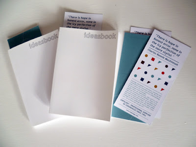
Since early 2011 I have exhumed most of my daylight hours working with an Oslo based agency focusing on exhibition and interaction design. Since 1993 Expology has been working in related fields until finding focus with the design of exhibition spaces, interaction and communication solutions. One of my first jobs with the studio was to create the identity for an Expology showcase at the Ecsite Annual Conference 2011 in Warsaw, Poland. Instead of the usual corporate filled pamphlet we decided to create notebooks printed in FSC certified Munken paper which encouraged the user to think and invent their own page filling solutions. Inside the 'Ideas book' are intentional spelling mistakes for recipients to stay alert and look out for, the mistakes are a play on the Charles Rennie Mackintosh quote 'There is hope in honest error, none in the icy perfection of the mere stylist'.
Expology identity designs for Ecsite 2011

Sunday, June 26, 2011

PRESS: DPI MAGAZINE

A few months ago Taiwanese graphic design and illustration magazine DPI featured my work and an interview as part of the 'Keen Creative Generation' issue. They were particularly interested in my collaborative work using graphics and music in events such as the DO IT! night I have been running with friends since 2008. Was an honor to get so many pages and be asked about my projects. Thanks DPI, be sure to pick up the mag online or a physical copy if you are visiting or live in Taiwan.
Images from DPI magazine issue 141

Saturday, May 28, 2011

DESIGN: UNIVERSITAT DE BARCELONA

Following on from my graphic work for the Universitat de Barcelona last year, I have been working on some more logo designs and taking these further by integrating them into web banner layouts.  The new logo, and team banner, was for the TEAM bureau. TEAM represents Trade Unions, Economic Change and Active Inclusion of Migrant Workers so a humanistic essence was at the core of the design. The final design incorporates a group of different sized people shapes huddled around each other with a wave like arrow flowing to the opposite end where the same icons exist in the reverse colour. You can see a glimpse of the final design below or in greater detail on the Universitat De Barcelona website.

My first project with Universitat De Barcelona was a logo design for ESRU, European Social Research Unit, so it was interesting to go back to that design and have the opportunity to develop the surrounding context via a web banner design. The design remains true to the abstract cubist forms of the original logo but, adds dynamism and depth to the banner.
TEAM logo and TEAM and ESRU web banner designs by Alexander Horne